iPhone Videos - Brushes

Entries in Photoshop (8)

Sunday
Nov262023

AI Paintover Tutorial Series 

About a month ago, I gave a presentation at my company, the Volvo Group, on generative AI tools. I will post the video of the presentation, but in preparation, I also made a series of videos showing off some generative AI tools, and then methods of editing the 2d content in mostly Photoshop and SketchbookPro. 

Sunday
Sep102023

The start of my AI journey...

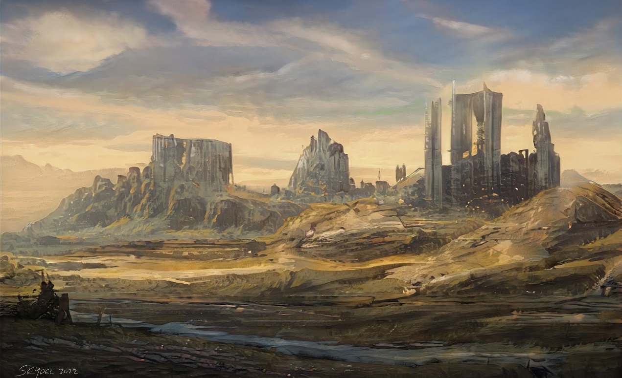
And to continue the backpedaling through what I have been doing creatively, I first started dabbling with AI image engines in late 2022, when I saw a presentation as part of a Gravity Sketch online conference, talking about using various AI models as inspiration. One that really caught my eye was ArtBreeder, which you can 'train' with your own images. I found the online interface interesting, almost like a game from the early 2000s, and then the results had me hooked. The results were a high enough resolution to be able to do a paintover in Photoshop or SketchbookPro, my fave 2d raster tools. 

Tuesday
May052020

The Shipment

I have been continuing with the experimentation with Tiltbrush speedsculpting, using this as the means to jumpstart ideas that I can finish either in 2d or 3d. I leave the symmetry tool on, and then use the matte poly brush for the big shapes, than add more detail, timeboxed at about 15 to 20 minutes. 

The export process direct to Photoshop as a 3d object was not working too well for me, mainly because this gave me less control over the lighting of the object as I imagined the airship fitting into my scene. Modo was an easy input and ouput to just modify the lighting quickly, and then make a render along with a mask that Photoshop could use to isolate the ship. 

Photoshop does a great job for image filters, layer management, and masking, but personally, I find the painting tools through the brushes to be tool slow from moving my Wacom pen to seeing the resultant stroke, whereas SketchbookPro is much faster on the uptake, and has more 'painterly' brush kits.

In this case, I placed the SketchbookPro .tif file as a linked Smart Object within Photoshop, so that when I made changes to the greyscale SketchbookPro image, it updated automatically in my Photoshop file underneath the color adjustments and sepia filter. 

Wednesday
Sep032014

Overlay updates for Skillshare Photoshop class

Some of the feedback that I have received from my Photoshop class on the basics of opening and editing an image in Photoshop talked about my fairly Mac-centric shortcuts. It's true that I have been working mostly on the Mac for a long time, but that's really no reaosn to leave others out in the cold. I'll make the overlays in Photoshop and build out to Final Cut.

Wednesday
Jul092014

Creative Cloud Updates

Disclaimer: these are the opinions of Matt Connors; not those of my employer, Quad/Graphics. I am not knowingly receiving monetary compensation from Adobe in any way, shape or form. 

A few days ago, Adobe pushed out the most recent version of Creative Cloud, 2014. I have to assume that a lot of people like me had been paying attention to all of the press and the fanfare about the advantages of being in the Adode Cloud and having access to the CS toolset: One of the biggest features was supposed to be that there would be incremental changes to a version of software - such as Illustrator or InDesign, but that this would happen to the existing copy of that software's version of CC. You can skip my editorial and go to the official press release here: http://blogs.adobe.com/photoshopdotcom/2014/06/crank-it-up-to-15-introducing-adobe-photoshop-cc-2014.html

Sure, we are still using CS 6 at QG sites in most cases, due to ImageXtreme, but we should know what clients may be asking about.

Imagine my surprise when a whole new application, Photoshop CC 2014 (along with a host of other apps) all installed into my Applications folder the other night on my laptop. The bad news is that I almost ran out of disk space when 6 applications all updated with new copies. So far the good news is that app presets migrate fairly easily as long as you say yes to a dialog box that pops open the first time you open the new app version, but it's still a whole new app with its own learning curve and interface. Some of us who are conservative about software hang onto older versions of the software just in case a client or a project will demand an older Photoshop or Illustrator, so this means another set of apps that you need to store on your hard drive. On my home machines, for instance, I keep Photoshop CC 2014, CC, and CS 6 on my main computer, and CS 6, CS 5, and CS 4 on my older laptop. Yeesh, that's a lot of copies of the same software…Adobe should really get into the business of selling hard drives; they'd dominate the world even faster that way. 

Far be it for me to dwell on this through, as I hope that our friends at Adobe will start to figure out what we all thought CC would mean for us; on to the updates starting in no particular order:

Swatch and Color Enhancements:
I am a junkie about my color sets and swatches, and any refinement to this area is appreciated; you can now expand the color box to see more of the hue change, which I like, as I can pull it open to select colors along a linear path to highlight or to shadow. The swatch dialog also shows the most recent sampled color from the eyedropper, which saves steps when you want to save out the swatches of a document that you've been working on. 

Layer Comps to Smart Objects: 
I can't get enough of layer comps; maybe it's the time that I spent working on User interface buttons/screen while in IPS, but it is a stronger feature now, especially if you want to set up 
complex layer combinations to represent the rounds that you show to a customer. It's an easy way to quickly make sense out of a complex file. This window to the right is much more comprehensive than it used to be in CC or CS6.


Blur Gallery is getting a lot of buzz, but I have a hard time imagining this being useful on a day-to-day basis. Watch the vid to learn more about it. 

Path Blur is probably the most directly useful in imaging work, and mores for the titles that have images moving quickly that should look even faster- cars, sporting shots, etc. The reality for prep is that more of our clients are looking to us to sharpen, not blur…this feature may have more of a direct impact with photographers.


Smart Object linking is a useful feature to make sure that you don't have orphaned elements, but there isn't much call to have exterior elements in our PS files anyway. 

Typekit Integration is new for Photoshop, but is had been in InDesign for CC; the addition really makes sense for what Adobe is trying to do with a cloud database for fonts, though this is a non-impact for prepress production, as we almost never have Photoshop files with any text. Check out the Typekit information page if you're new to the concept; they break down fonts according to use for web (online) and offline, which is most likely how we would use the fonts for prepress. 

Content-Aware Fill also got an upgrade, there is less chance of having light or dark halo around the replaced area, though I need to play with this more.

Expanded 3d Tools include the ability to link to 3d warehouses like Turbosquid  for input and 3d printers for output, all of which are like putting a screen door on a submarine. Don't get me wrong, I am a 3d enthusiast, but Photoshop - regardless of their updates in the versions of CC, is just a tough place to edit your 3d files, unless you are just making a lighting change or work on some 3d type effects. The interface and space looks cool, though, and I do like the cyc wall kits (see below). They make for a good, easy way to showcase a model. 

And now for a curve ball: Adobe Photoshop Mix and Lightroom-
Adobe's big play for the mobile market

Up until now, the mobile offerings of Adobe have really not held a candle to what you can do with Photoshop on the desktop. The first few apps like Touch were toys, though I have seen amazing illustrations done with Adobe Ideas on an iPad. See a quick piece by a guy I know:
https://www.flickr.com/photos/fabriclenny/10967551114/in/photostream/
The video below talks about some of the reasons for the previous limitations of phot apps on mobile devices, most of which build down to the lack of computing power of the device to complete mathematically challenging tasks. Mix allows you to see basically the smaller version of the file that exists in the cloud, so you can make more complex edits, which are just giving instructions to the cloud server to edit the image and serve it back to you. Pretty amazing, eh? (Retouchers all groan in unison)
http://mix.adobe.com/

https://www.youtube.com/watch?v=a1bfmtt6txM